Advertising Campaigns
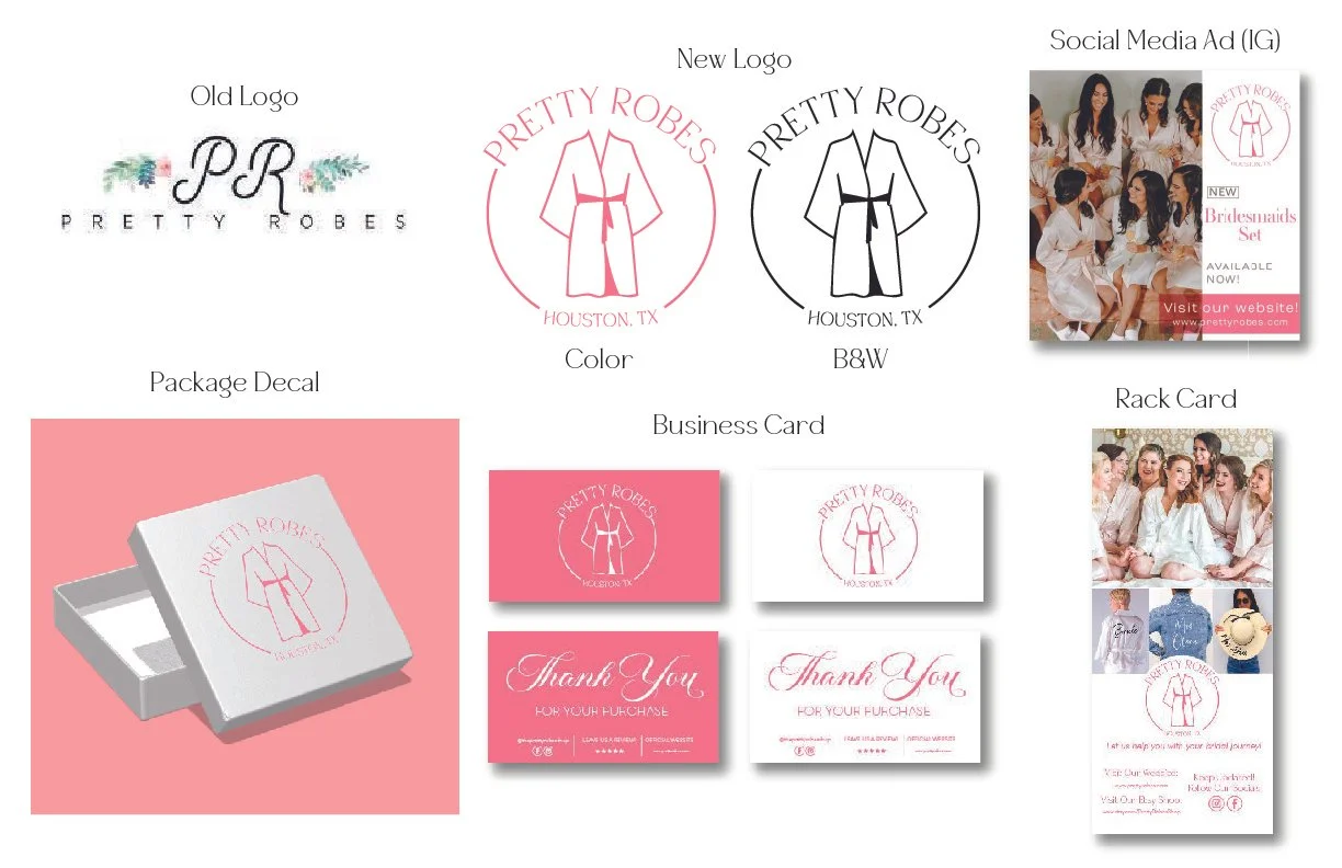
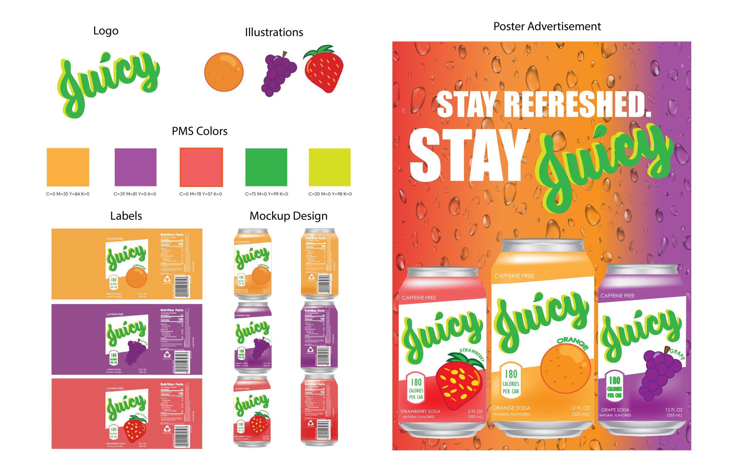
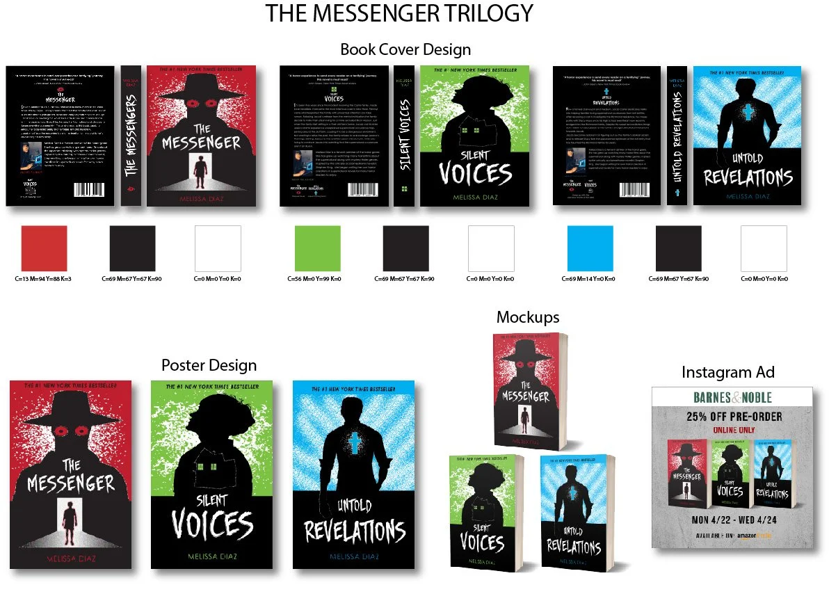
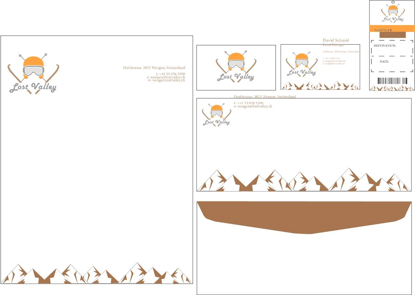
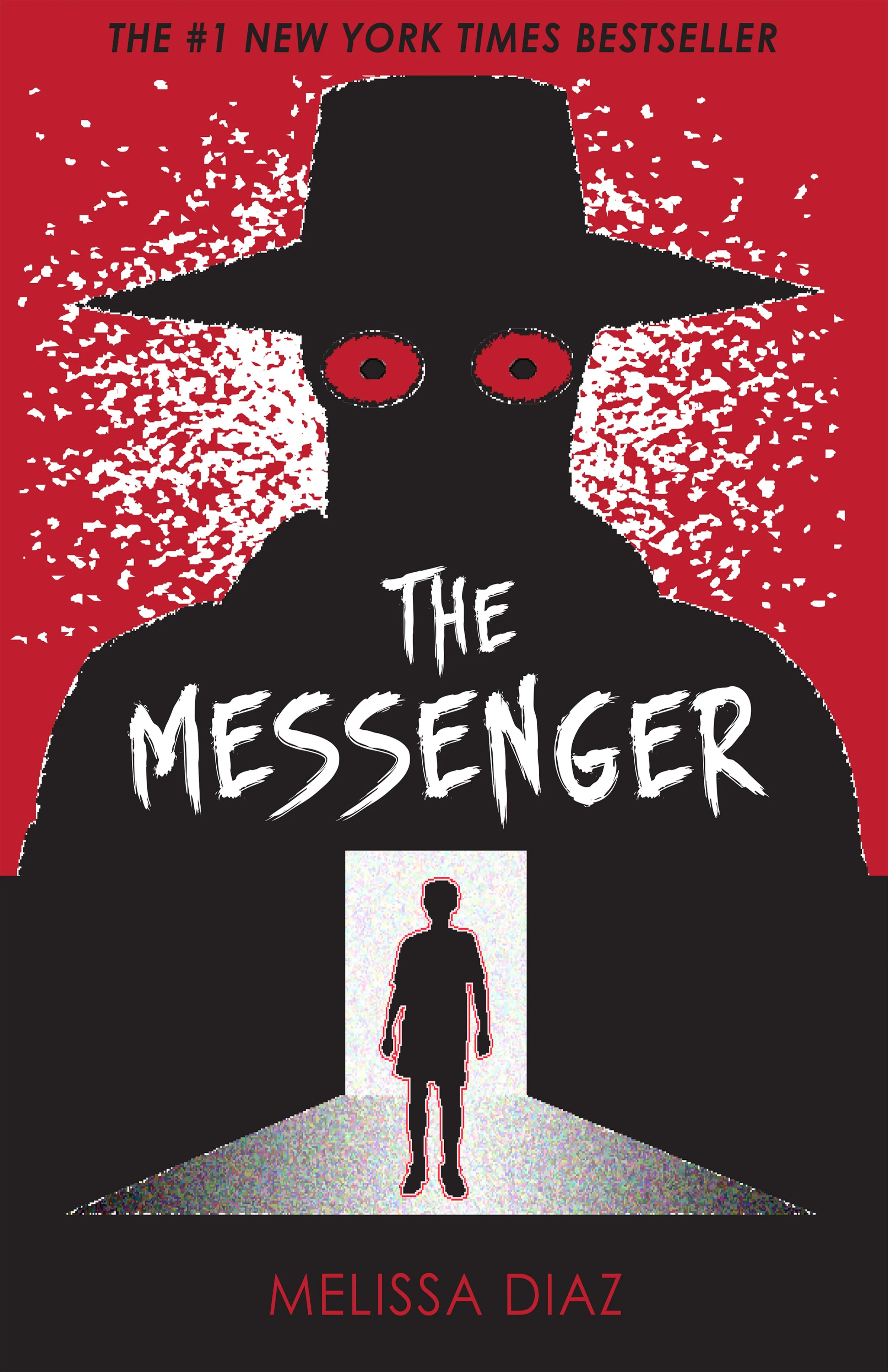
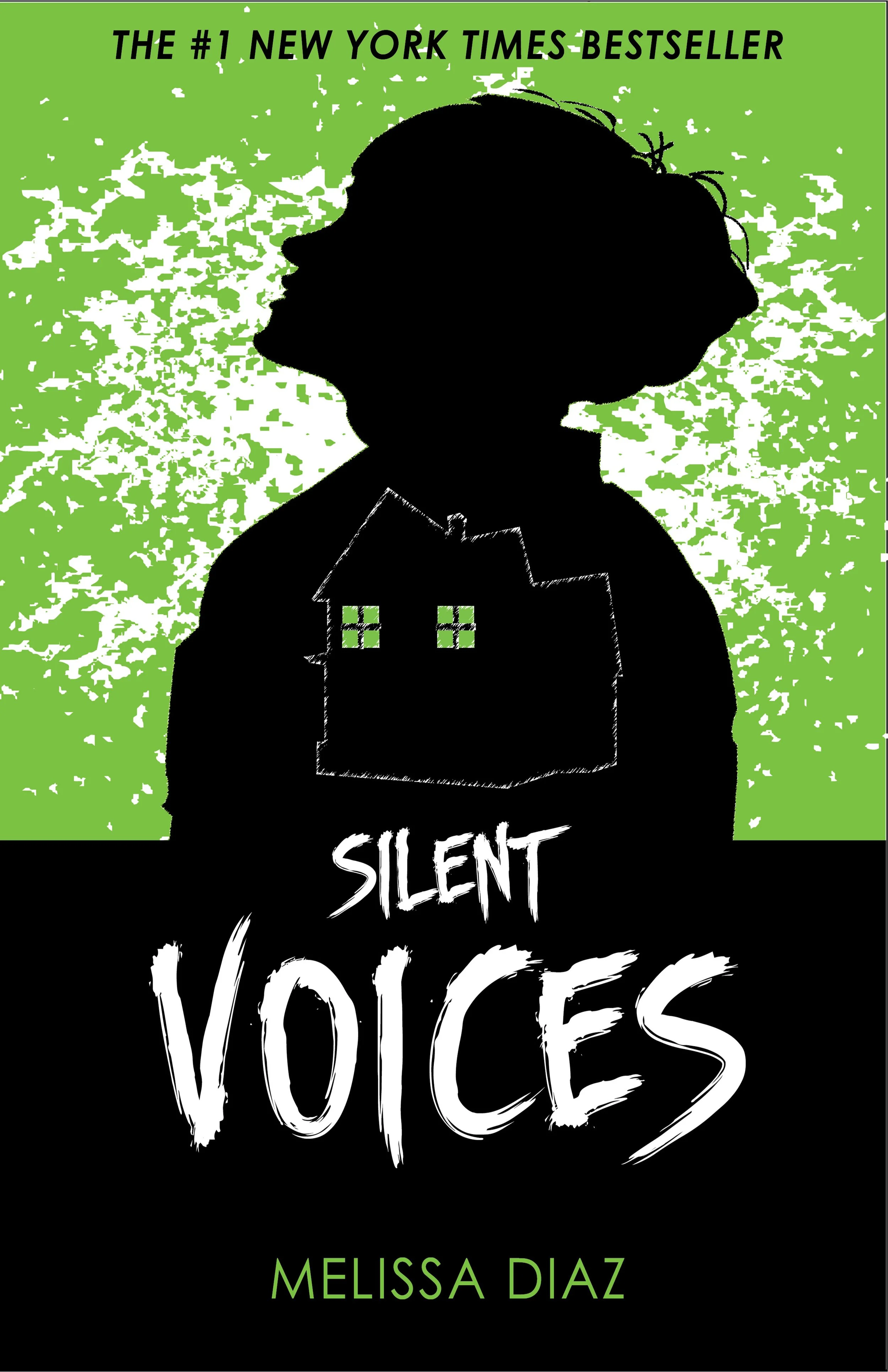
Explore Energy Company is a forward-thinking venture focused on innovative solutions in the energy sector. With your logo and advertising campaign design, you've successfully captured the essence of the company's vision: exploration, sustainability, and cutting-edge technology. The logo embodies the dynamic spirit of your company, reflecting its commitment to pushing boundaries and discovering new energy possibilities. Meanwhile, your advertising campaign effectively communicates the company's message, highlighting its dedication to renewable energy sources and environmental stewardship. Through your design work, you've helped establish Explore Energy as a leader in the quest for a cleaner, more sustainable future.Redesigning the logo for Pretty Robes, a boutique e-commerce shop specializing in bridal apparel and accessories, presents an exciting opportunity to capture the essence of the brand's charm and elegance. By incorporating elements that reflect the company's focus on bridal wear, such as delicate lace motifs or sophisticated font choices, the new logo will evoke a sense of romance and style. The redesign aims to enhance brand recognition and appeal to the target audience of brides-to-be and fashion-forward shoppers. With a fresh and modern logo, Pretty Robes will continue to stand out in the competitive online marketplace, attracting customers seeking premium-quality robes and denim jackets for their special occasions.Juicy Company is dedicated to providing delicious and healthy beverage options for both kids and adults alike. As the designer behind the logo and advertising campaign, you've successfully captured the essence of the Juicy brand: vibrant, refreshing, and caffeine-free. The logo design reflects the juicy goodness of the products, with bright colors and playful imagery that appeal to all ages. Your advertising campaign emphasizes the natural ingredients and the benefits of choosing a caffeine-free option, positioning Juicy as the go-to choice for families seeking a refreshing and nutritious drink. With your creative touch, you've helped establish Juicy as a trusted brand in the beverage market, known for its commitment to quality and wellness.I was assigned to create book covers for a triology series, as well as creating a plot and selecting a drama. The illustrations are different on each book cover, as well as the color palettes for each book. The concept was to make each book stand out on its own, along with maintaing the style with the illustration. The book tirology is based on a young boy name Jacob, imbarking on a paranormal journey that haunts him throughout his adolesence and young adults years. The book series was expanded as an advertising campaign to express more of an authentic feel for any horror audience.The challenge for this project was to create a staionary design for a ski resort. ‘Lost Valley’ is a family friendly resort situated in an affluent mountain village- Wengen, Switzerland. The resort hosts international conferences, events and is popular among tourists because of its location. The main annual sport activity is skiing and there are ski competitions every year, the famous ‘Lauberhorn ski races’. The classic ski races have been held in Wengen since 1930, and traditionally consist of a downhill, a slalom, and a combined event. In addition to being one of the technically most challenging downhill races, the Lauberhorn is the longest race in the FIS World Cup circuit and arguably the most scenic. The purpose was creating a new brand identity for the ski resort, to which everything, minus the text, was handdrawn. ILLUSTRATIONS
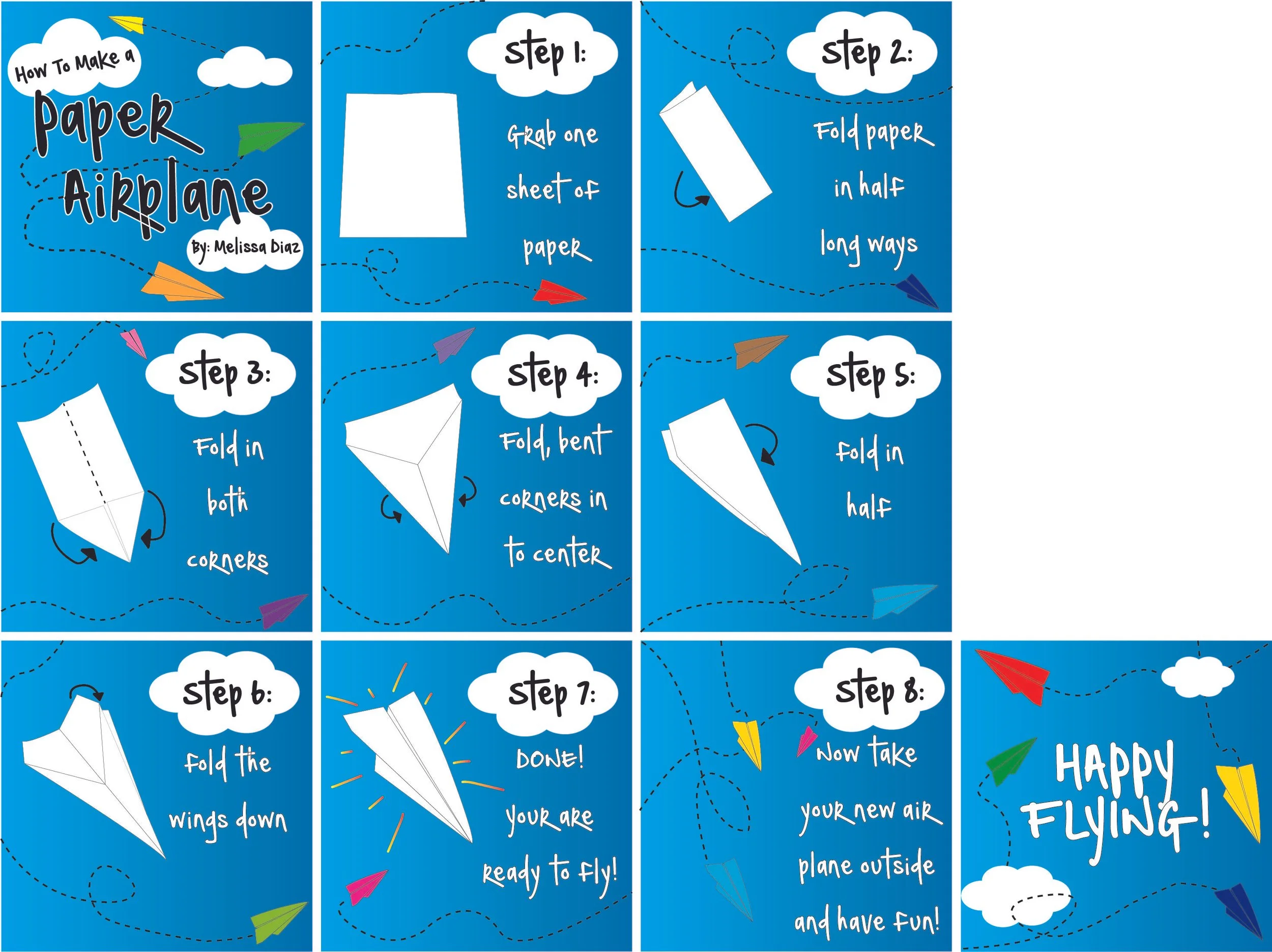
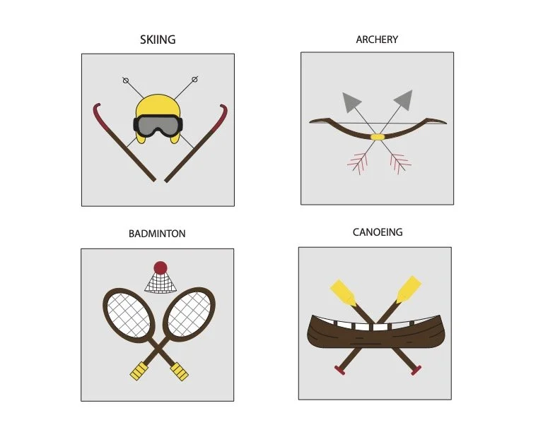
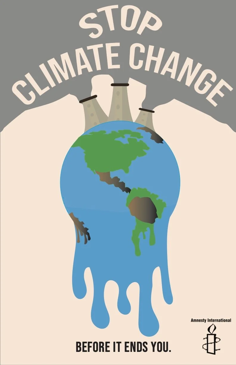
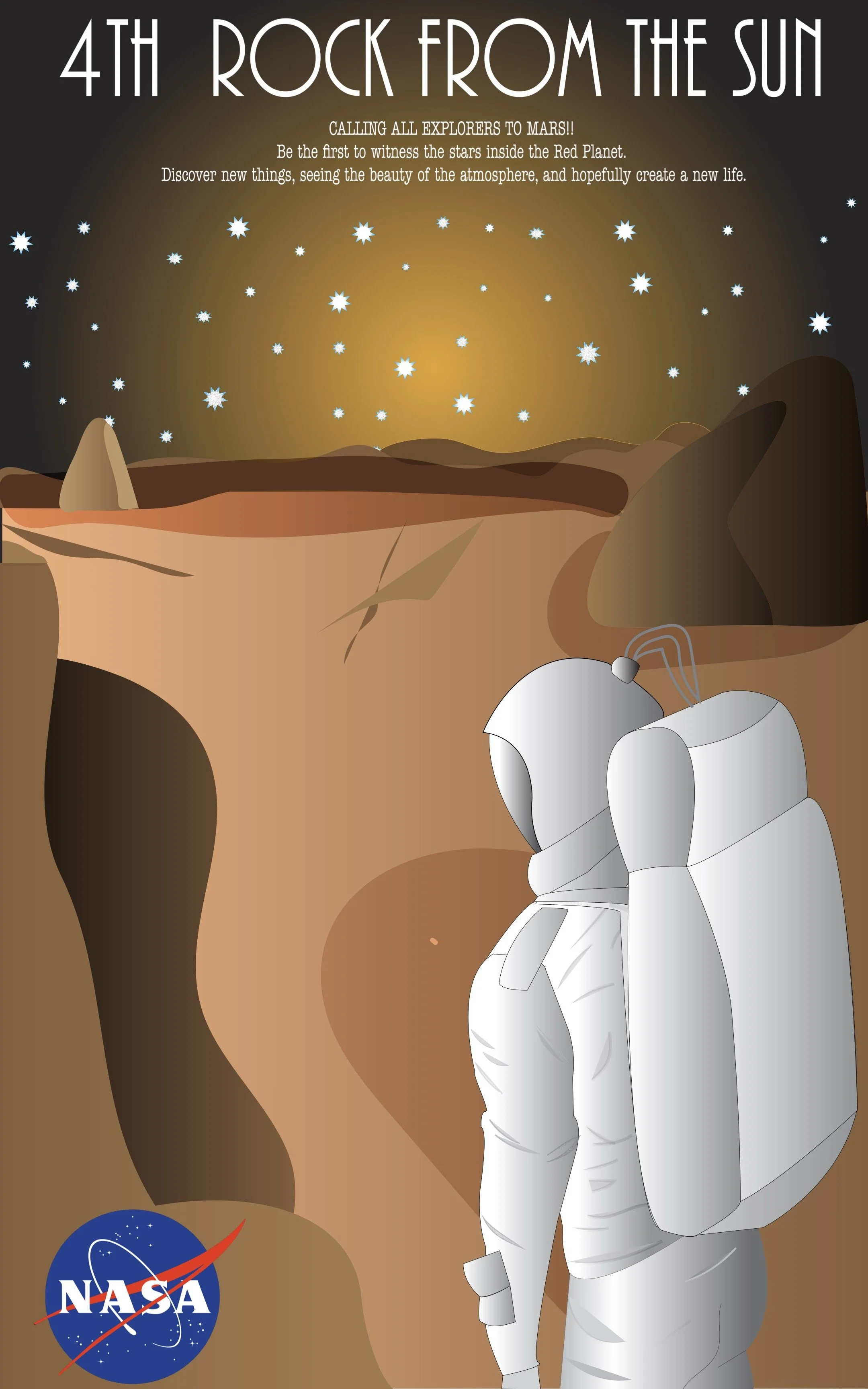
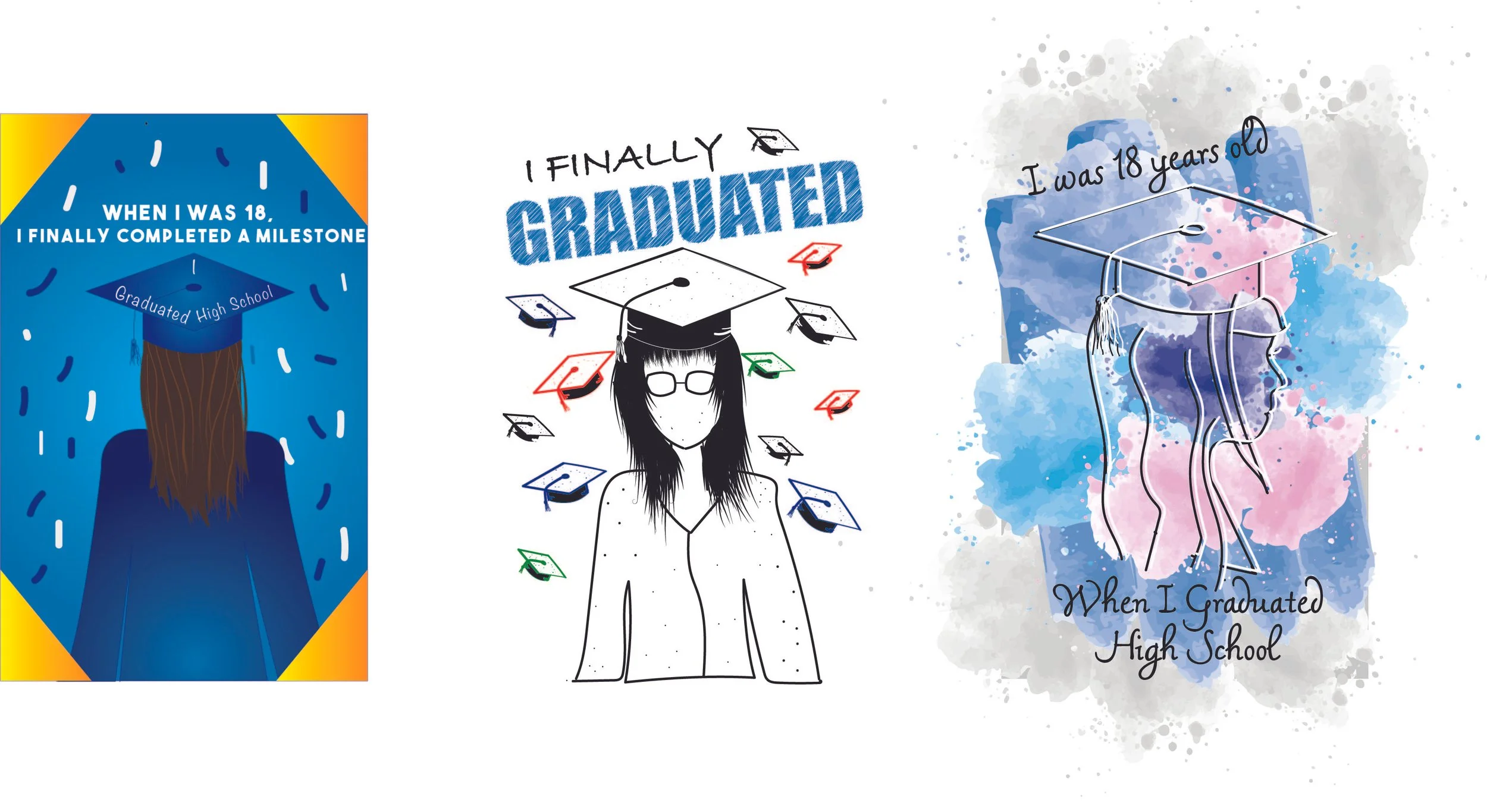
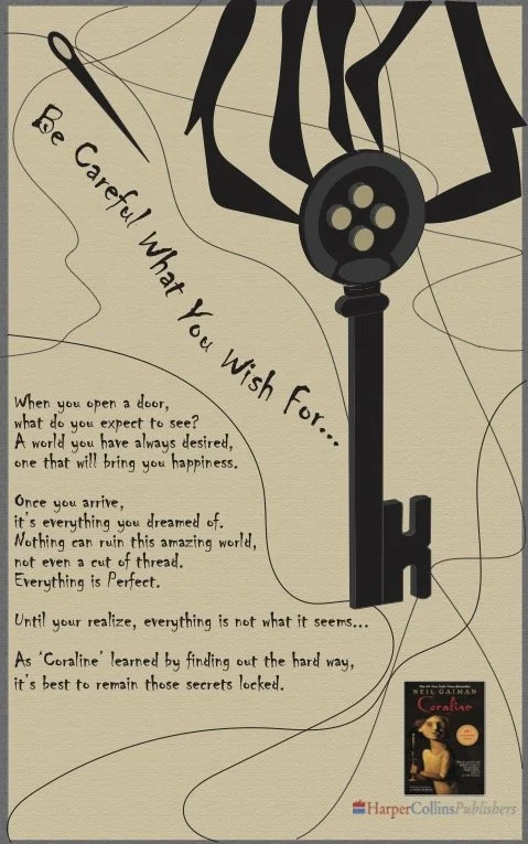
Illustration for a children's book on making a paper airplane.Illustration for a couple icons made for a ski resort project, "Lost Valley", used for the staionary design projectIllustration for a climate change poster for a school assignment.Crafted with a blend of artistry and scientific precision, your NASA poster titled "4th Rock From The Sun" encapsulates the enigmatic allure of Mars, Earth's neighboring planet. Through meticulous design and vivid imagery, you ingeniously capture the essence of Mars as the fourth celestial body from the Sun, highlighting its distinct features, from rust-hued landscapes to captivating Martian skies. Your poster serves as a visual ode to humanity's fascination with the Red Planet, inviting viewers on an immersive journey through the mysteries and wonders of our solar system's captivating neighbor.In a testament to my creative prowess, I've embarked on a transformative journey through three distinct illustration styles, each capturing the significance of my high school graduation, a pivotal milestone as I turned 18. With masterful strokes, I breathe life into memories, delicately portraying the euphoria of accomplishment through vibrant colors and whimsical lines in a playful, cartoon-inspired rendition. Transitioning seamlessly, you delve into a realm of realism, infusing depth and detail to immortalize the solemn dignity of the ceremony, evoking a sense of nostalgia and reverence. Finally, I venture into the avant-garde, embracing abstraction to symbolize the multifaceted emotions and complexities intertwined with this rite of passage, leaving viewers mesmerized by the raw and evocative essence of your experience.Illustrations for the book cover series for the selfmade horror trilogy of "The Messanger"Illustration for a small book ad. I created a book ad for the book, "Coraline", eveything being handdrawn minus the text.PHOTO MANIPULATION
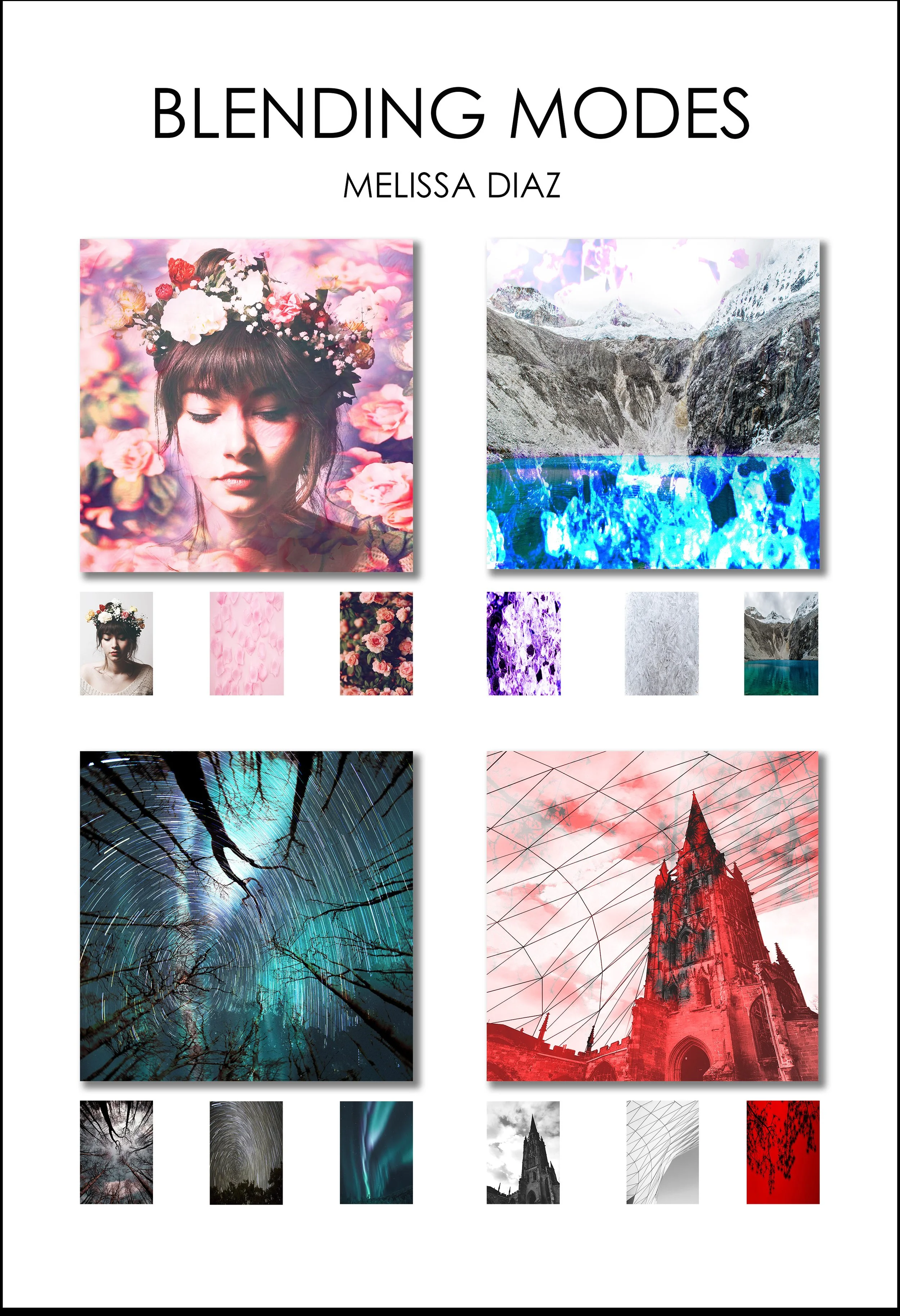
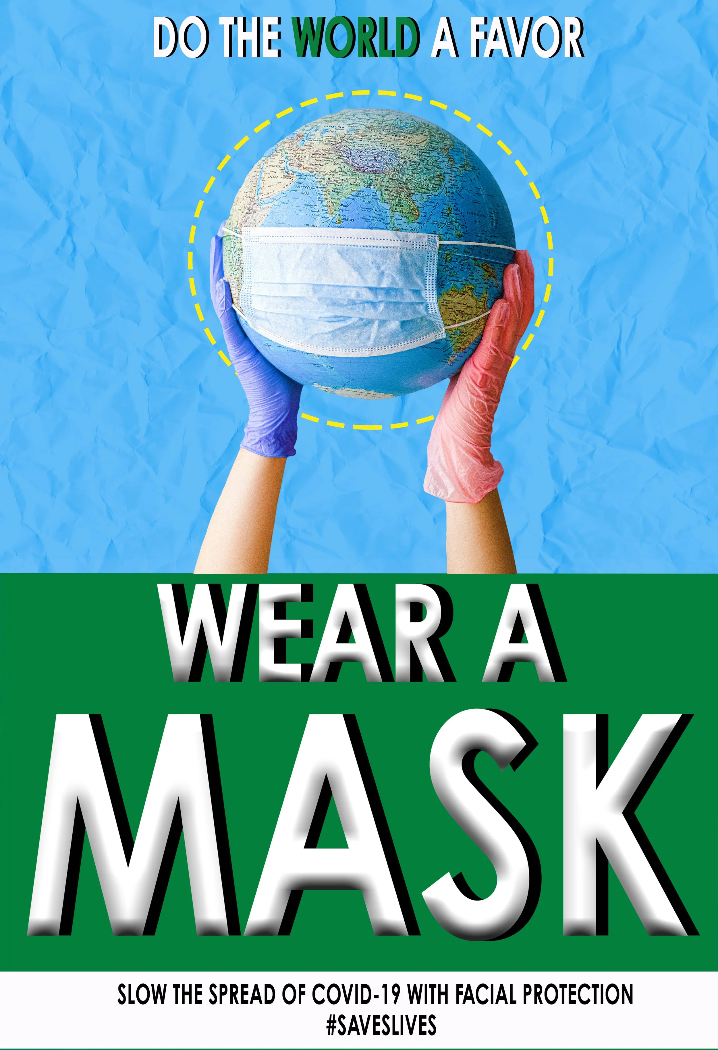
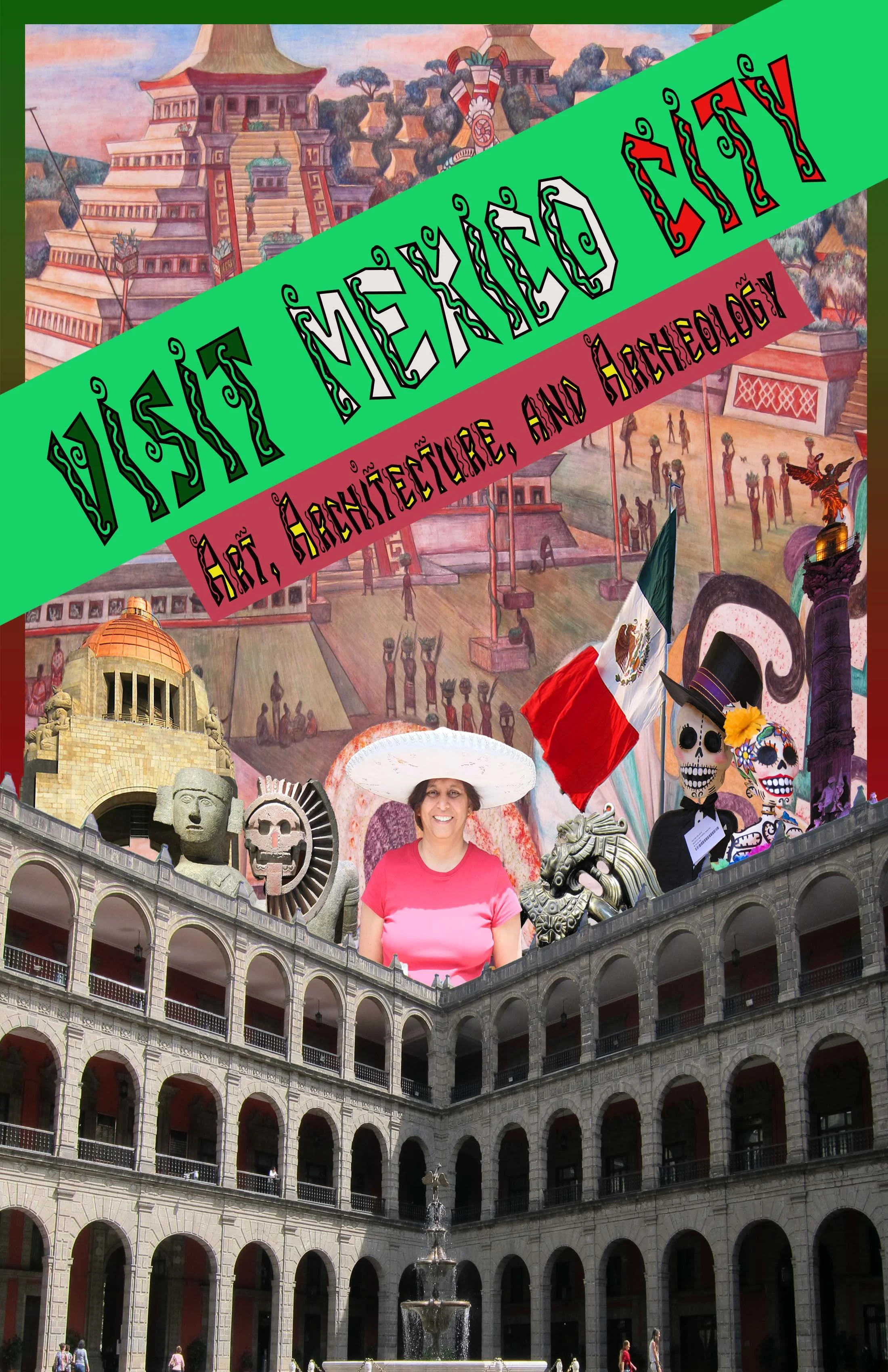
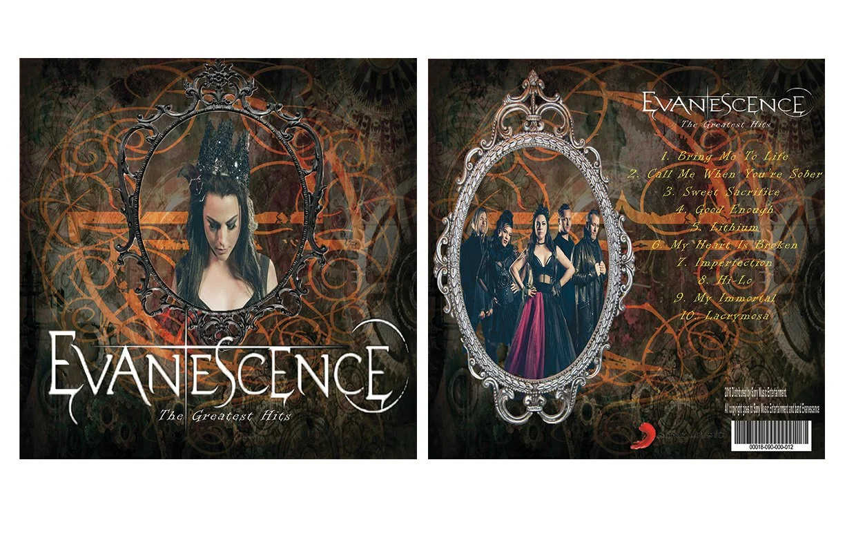
The project was made with a concept of creating a movie poster. The challenge was to create a movie poster in which we were made to include ourselves in the poster. A genre was selected, along with a plot. The plot was able a young girl trying to survive a apocalyptic world, now deserted to which has to find a way to make it to safe sanctuary.The concept was to select three images, in order to create a photo manipulation piece using the blending modes on Photoshop software.During the 2020 Covid Pandemic, the assignment was to create a poster to advocate people following safety regulations. The concept was to have citzens wear a mask to prevent spread of the virus and to remain safe. I made sure to have the main call of action read by making the text large.In the captivating photo manipulation poster beckoning travelers to Mexico, I seamlessly blend imagery to evoke the vibrant spirit and allure of this culturally rich destination. With a masterful eye for composition, I weaved together iconic landmarks, breathtaking landscapes, and cultural symbols into a visually arresting tapestry. Vivid hues dance across the canvas, echoing the warmth and vitality of Mexico's people and traditions. Through meticulous attention to detail, I crafted a narrative that invites viewers to embark on an enchanting journey, promising unforgettable experiences and unforgettable memories amidst the beauty and charm of Mexico.IThe purpose of this project was to work on my photo manipulation skills by creating an album cover. THe album cover made was under the famous heavy metal band, Evanescence, paying tribute to their most popular songs throughout their musical journey. The aesthetic was to hav e steam-punk gothic feel, using the images of the band themselves.Typography
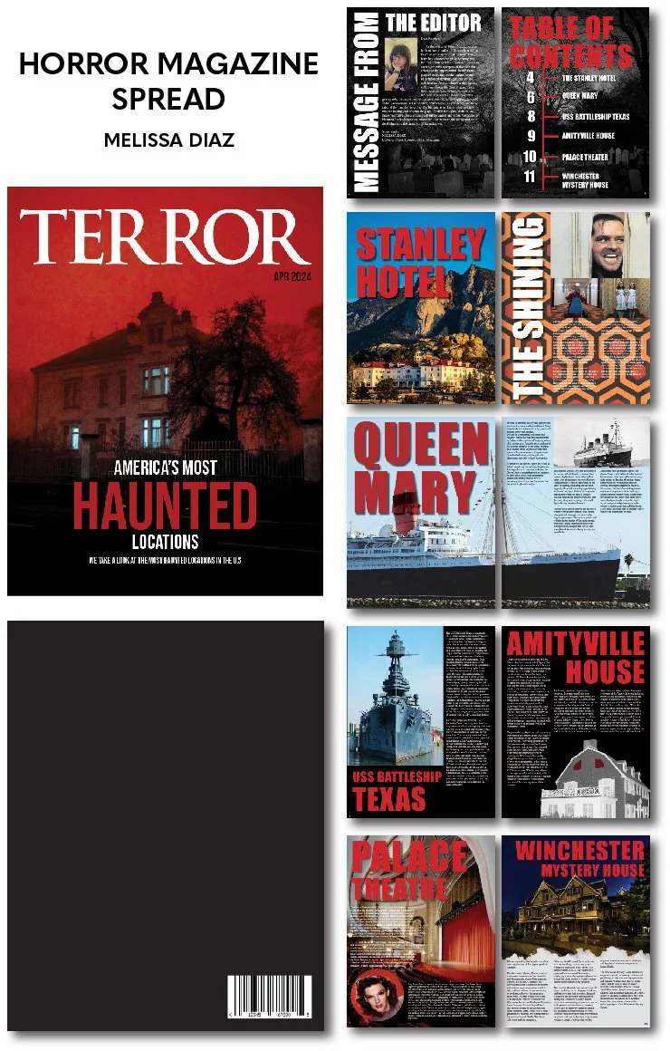
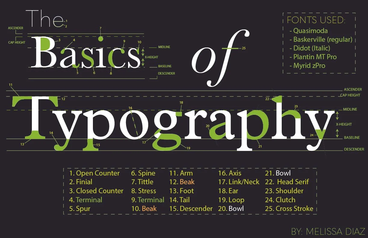
This was a magazine spread I made about the most haunted places in america. Wanted to go for a proffesional but a spooky look for readers to. see.Typography, the art and technique of arranging type to make written language legible, readable, and appealing, encompasses a range of fundamental principles. At its core, typography involves the selection of typefaces, the arrangement of text, and the spacing between characters and lines. Typeface selection involves choosing fonts with distinct personalities and characteristics that align with the intended message and audience. The arrangement of text considers factors such as hierarchy, emphasizing key information through variations in size, weight, and style. Additionally, attention to spacing, including kerning, leading, and tracking, ensures optimal readability and visual harmony. Typography serves as a powerful tool for communication, conveying not just words, but also mood, tone, and message through the intricate interplay of letters and design elements. The project was to make a poster to point out every element within the basics, making it easier for the audience to under the type in design. I went for a green and black approach to make it easier to read, laying out everything accordingly. This is definitely one of my most proud assignments ever made. 

